Box Plot Generator
Generate a Box Plot from Five Numbers
The Complete Guide to Box Plots: What They Are, How They Work, and When to Use Them
What is a Box Plot?
A box plot (also called a box-and-whisker plot) is a powerful data visualization tool that displays the distribution of numerical data, highlighting central tendency, spread, and outliers. It is built from the five number summary: minimum, first quartile (Q1), median (Q2), third quartile (Q3), and maximum.
- Box: Shows Q1 (25th percentile), median (Q2, 50th percentile), and Q3 (75th percentile).
- Whiskers: Extend to Q1 - 1.5×IQR and Q3 + 1.5×IQR, or to the dataset’s minimum and maximum.
- Outliers: Data points beyond the whiskers, often marked with dots or asterisks.
Why Use a Box Plot?
- Visualize data distribution: See the spread and center of your data at a glance.
- Identify outliers: Instantly spot unusual values for further analysis.
- Compare groups: Place multiple box plots side by side to compare different datasets (e.g., A/B testing).
Best for:
- Statistical analysis: Quickly understand central tendency and spread.
- Data cleaning: Detect outliers (e.g., extreme income values).
- Academic research: Compare experimental and control groups.
- Business analysis: Compare sales distributions across products or regions.
When to Use a Box Plot?
| Scenario | Example | Box Plot’s Role |
|---|---|---|
| Data distribution analysis | Student test scores | See score ranges and gaps |
| Outlier detection | Website session durations | Spot unusually short/long visits |
| Comparing groups | City home prices | Compare medians and spread |
| Skewness check | Employee salaries | See if data is right-skewed |
Box Plot Result Examples
Below are several example box plots generated from different five-number summaries. These visuals help you understand how the five-number summary translates into a box plot, highlighting the minimum, quartiles, median, and maximum values in various data distributions.
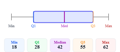 Symmetric distribution
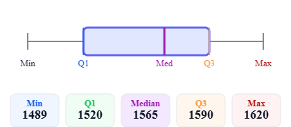 Right-skewed distribution
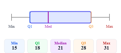 Left-skewed distribution
Box Plot vs. Other Charts
| Chart Type | Best Use | How It Differs from Box Plot |
|---|---|---|
| Histogram | Show distribution shape | Box plot focuses on summary stats (quartiles, outliers) |
| Scatter plot | Show relationship between two variables | Box plot shows only one variable’s distribution |
| Line chart | Trend analysis (e.g., over time) | Box plot does not show time trends |