Five Number Summary in Excel
Using Excel Formulas
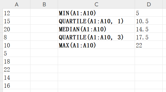
Step 1: Enter Your Data
- Open Excel and input your dataset into a single column (e.g.,
A1:A10). - Example:
Example Data
12, 15, 20, 8, 10, 5, 18, 22, 14, 16
Step 2: Calculate the Five-Number Summary
Use the following Excel functions in separate cells:
| Statistic | Excel Formula | Example (Assuming data in A1:A10) |
|---|---|---|
| Minimum | =MIN(A1:A10) | =MIN(A1:A10) → 5 |
| Q1 (First Quartile) | =QUARTILE(A1:A10, 1) | =QUARTILE(A1:A10, 1) → 10.5 |
| Median (Q2) | =MEDIAN(A1:A10) | =MEDIAN(A1:A10) → 14 |
| Q3 (Third Quartile) | =QUARTILE(A1:A10, 3) | =QUARTILE(A1:A10, 3) → 18 |
| Maximum | =MAX(A1:A10) | =MAX(A1:A10) → 22 |
✅Alternative:
- You can also use =PERCENTILE(A1:A10, 0.25) for Q1 and =PERCENTILE(A1:A10, 0.75) for Q3.
Tip: These formulas work in most modern versions of Excel. For Newer versions, use QUARTILE.INC instead of QUARTILE.
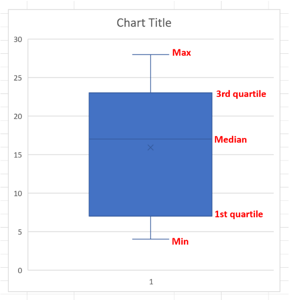
Creating Boxplots in Excel
One of the most effective ways to visualize a five number summary is by creating a boxplot (also called a box-and-whisker plot). This visualization uses a box with a line in the middle along with “whiskers” that extend on each end, providing an intuitive way to understand your data distribution.
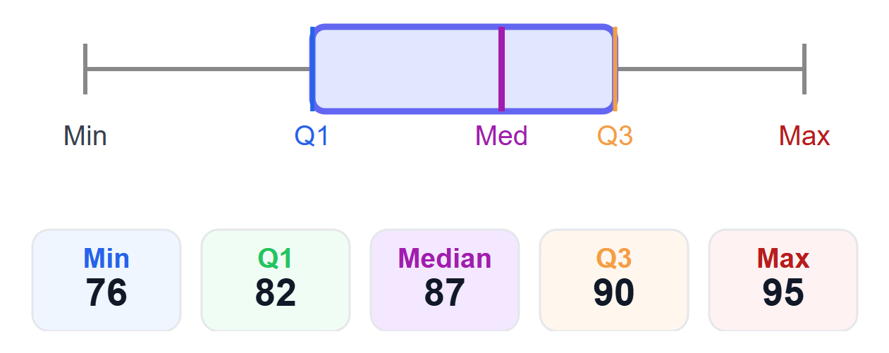
Understanding Boxplot Components
Box Elements
- Top of box: Third quartile (Q3)Purpose: Marks the upper boundary of the middle 50% of the data (75th percentile).
- Middle line: Median (Q2)Purpose: Divides the dataset in half; 50% of values are above, 50% below.
- Bottom of box: First quartile (Q1)Purpose: Marks the lower boundary of the middle 50% of the data (25th percentile).
- Box height: Interquartile range (IQR = Q3 - Q1)Purpose: Measures the spread of the middle 50% of the data; shows variability.
Whisker Elements
- Top whisker: Maximum valuePurpose: Shows the largest value in the dataset (excluding outliers).
- Bottom whisker: Minimum valuePurpose: Shows the smallest value in the dataset (excluding outliers).
- Whisker length: Shows data rangePurpose: Visualizes the overall spread of the data from minimum to maximum.
Step-by-Step Boxplot Creation
1
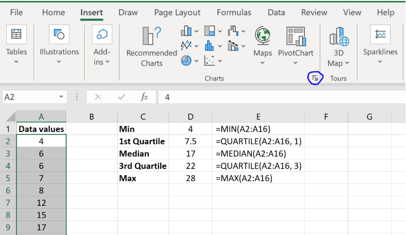
Highlight Your Data
Select the column containing your dataset (e.g., A1:A10).
Selected Data Range
A1:A10
2
Access Chart Options
Go to the Insert tab → Charts group → Click the small arrow in the bottom-right corner to “See All Charts.”
Tip: Look for the small arrow icon in the Charts group
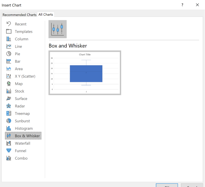
3
Select Box & Whisker Chart
In the chart selection dialog, choose “Box & Whisker” from the available chart types and click OK.
Result: Excel will automatically generate a professional boxplot
Customization Tips
- • Change colors: Right-click on chart elements to modify colors and styles
- • Add title: Click on the chart title to edit or add a descriptive title
- • Adjust background: Format the chart area for better visual appeal
- • Add data labels: Show exact values on the boxplot for clarity
Note: Boxplots are available in Excel 2016 and later versions. If you're using an older version, you may need to create the visualization manually using the five number summary values.